10 Paint Colors With Cult Followings
Posted in Angelcityfurniture
Choosing a paint color can be overwhelming. Yet, for all of the thousands of colors out there, a handful have become revered go-tos that we see used over and over again by pros and regular people alike. Take a look at these ten lauded colors that the internet can’t seem to get enough of .
Hale Navy by Benjamin Moore
Take Benjamin Moore’s Hale Navy , seen in the kitchen above by Studio McGee . Not only has it become one of the go-to blues for the husband-and-wife design team, Hale Navy is also one of the top color requests for paint service PaintZen .
Though it’s an intense choice, the deep blue doesn’t feel jarringly bold—especially when used for cabinetry (as it so often is). In an interview with Elle Decor , designer Katie Hodges called out this quality when she summed up Hale Navy’s ability to “make a strong statement without being intimidating,” partially in thanks to the color’s gray undertones.The rich color isn’t the only one beloved by designers, bloggers and seemingly everyone in between. (Let alone the only beloved blue.) Here are other colors that have a very strong fanbase:
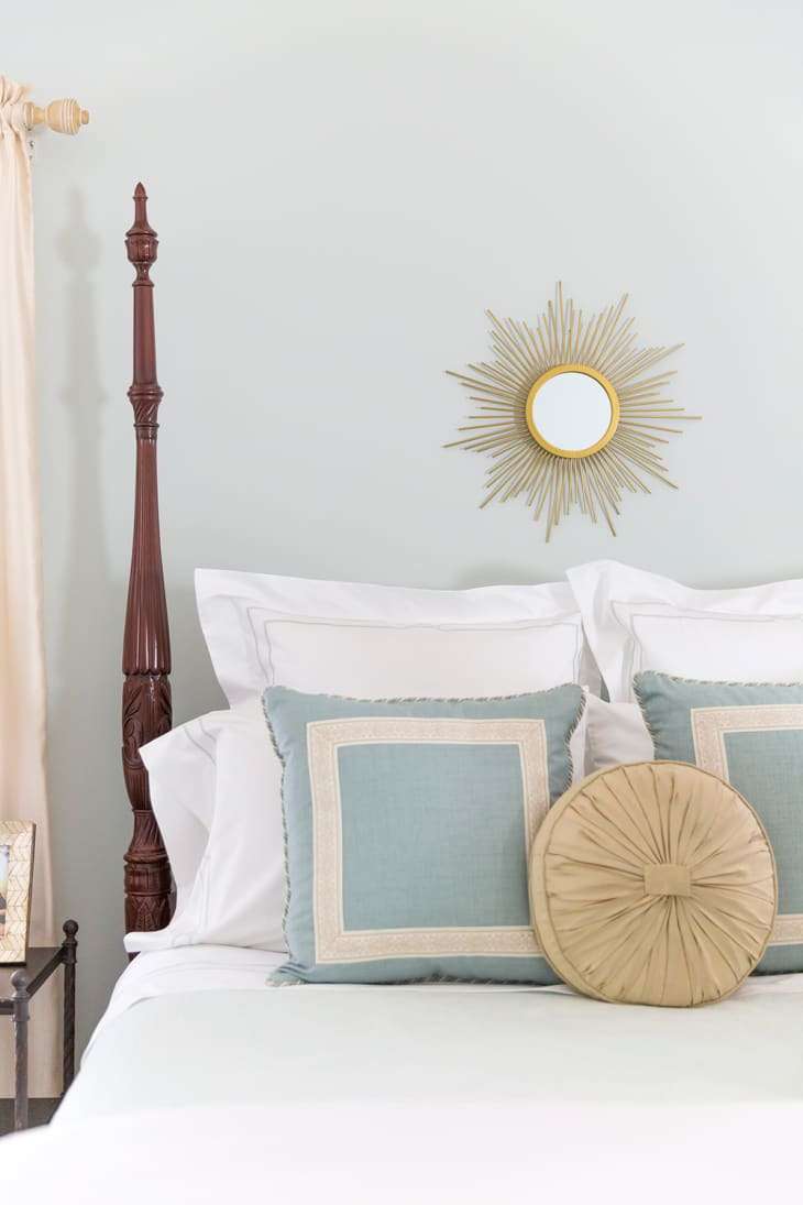
Sea Salt by Sherwin-Williams
Soothing colors tend to be more popular than bolder ones, which is why pale greens and blues will never fall out of fashion. Courtney Whitmore of Pizzazzerie used Sea Salt for her guest bedroom for its calming, not-too-obtrusive qualities. You’ll find Sea Salt popping up again and again on lists of perfect paint palettes , especially if you’re following the coastal or farmhouse aesthetic.
Wythe Blue by Benjamin Moore
Just a heads’ up: Bloggers and designers heavily trend towards Benjamin Moore paints, which is why you’ll see a bunch of shades from the brand on this list. Wythe Blue was actually the brand’s 2012 Color of the Year (and was introduced in 1976), but is still a top-requested choice—particularly for front doors, like this one by Suburban B’s .
Hague Blue by Farrow & Ball
Yes, it’s true: We all just can’t get enough blue. This deep, dark shade can appear nearly black depending on the light in the room. It’s a favorite of design firm Park and Oak (who designed the above space), and another favorite of Studio McGee . Whether you paint an entire room in the dramatic shade or use it as an accent, Hague Blue definitely makes a impression.
Salamander by Benjamin Moore
Speaking of dramatic colors, Salamander could be the next navy. The saturated green was named by CB2 as a top color of 2016 , and there’s been an uptick in its use in many a makeover. Ashley from The Gold Hive used it recently for the living room of her 1914 bungalow (above) as part of the “One Room Challenge.” Here, it brings an edge to the space, though it can also go in a vintage farmhouse direction.
China White by Benjamin Moore
Though Benjamin Moore’s Decorator’s White will always remain popular, China White offers a little more warmth without looking yellowish. It pairs very nicely with wood tones and other neutrals, as in this space by Lauren Davenport Imber featured in Atlanta Homes & Lifestyles . It’s also a favorite of designer Eric Cohler , who likes China White’s ability to appear on the wall as a “true white — but with a little more body.”
Intimate White by Sherwin-Williams
Though it’s white in name, this shade frequently makes lists of the best pink paint colors . As you can see from the above nursery in the home of Mandy Reeves , the color has a soft blush cast. It’s ideal for those who want to try out pink but are wary of a too-intense shade.
Chelsea Gray by Benjamin Moore
Grays are still popular for interiors and exteriors, but certain shades stand out a bit more than others. Chelsea Gray seems to have an edge over similar hues in the color family, particularly when it comes to cabinetry (like the bathroom vanity seen on Elements of Style ). Designer Erin Gates also uses it frequently for cabinetry, considering it the “perfect medium-dark gray.”
Pale Oak by Benjamin Moore
Greige has bounced back in popularity, particularly on the lighter end of the spectrum. Depending on the light in the room, Pale Oak can seem almost white or almost totally greige. We have to say that we like it best in rooms with plenty of sun, like this bathroom by Cortney from A Thoughtful Place . The soft hue adds the merest hint of warmth that promotes the soothing spa-like setting Cortney wanted—and it’s hard to believe this sophisticated space is actually a children’s bathroom (lucky kid).
Pigeon by Farrow & Ball
A name like “pigeon” might conjure up images of gray, but this color is in that sweet spot between green and blue (with gray undertones). Jason Arnold of Jason Arnold Interiors likes that Pigeon complements both light neutrals and richer tones, making it one of the more versatile colors out there for those who don’t want to go with a true gray or greige. It’s become a popular choice for cabinetry, like the lower cabinets in this kitchen by Sarah Sherman Samuel .
These might be some of the hottest colors in the online design world right now, but we’d love to hear from you on your own personal favorites. Chime in!