The Most Popular White Paint Colors
Posted in Angelcityfurniture
White paint may seem like the simplest choice, but there are just as many shades to choose from as with any bolder hue. In fact, there are warmer whites and cooler ones, and how the paint ends up looking in your home depends on what else is in the room and what the light is like. It’s important to pay attention to the undertones as you pick your paint, since they’ll impact the atmosphere in the space and can mean the difference between stark and cozy. The key to choosing a white paint color is actually trying it in the room. Get samples of your top few picks and paint generously sized swatches on the wall. You can see how the colors look at different times of day and under various lighting conditions. A shade that looks beautiful in natural light may look completely wrong when the lamps come on at night. Testing the color will help you pick the perfect shade and avoid any surprises after the final coat is applied.
Many designers have tried-and-true whites that they return to for project after project. For designer Madeline Stuart, it’s Benjamin Moore’s White Dove , which she used in her own Santa Barbara home . “It’s not too sterile and has virtually no yellow—just enough to take the edge off. It instantly transformed the home.” Designer Bruce Bierman has a trio of go-to paints. “The whites we use—usually Benjamin Moore’s Chantilly Lace, Donald Kaufman Color’s 51, and Pratt & Lambert’s Pro-White—balance the light in the room,” he told AD .
Feeling a little overwhelmed? Drop your fan decks and read on. We’ve narrowed your options down to ten of the most popular white paints for sale right now from the country’s top brands. If so many of your fellow decorators and remodelers love these colors, chances are you will, too.
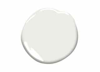
Benjamin Moore’s White Dove (OC-17) is a versatile neutral shade that counts designers Madeline Stuart and Nestor Santa Cruz as fans. “White Dove has been an extremely popular white, as it is especially neutral and it complements a wide range of colors,” Benjamin Moore color and design expert Andrea Magno told AD . The shade is a go-to for walls, trim, cabinetry, and other millwork, and it consistently ranks as a top-selling paint for the company. The shade has a touch of gray that keep it from feeling stark. “White Dove also maintains enough warmth so that it is not too cool, yet it does not go too creamy or yellow,” Magno said.
Pointing by Farrow & Ball is named is named after the color of lime pointing used in brickwork. The popular shade has warm undertones and helps soften darker hues. Design duo Kapito Muller and decorator Timothy Corrigan have all used Pointing in their projects.
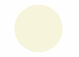
Swiss Coffee (7002-16) by Valspar is a warm white that can help make a bedroom or living room feel more intimate. The company suggests pairing it with other warm neutrals or shades of mint and teal.
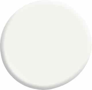
Designer White (33-1) by Pratt & Lambert Paints is a crisp and classic shade. On the cooler side of the spectrum, the color is a wonderful complement to bold hues and works both indoors and out.
Dover White by Sherwin-Williams (SW 6385) is a warm neutral that creates a soft and inviting look. The shade pairs well with soft browns and muted blues and is great for creating a cozy kitchen.
Olympic ’s Delicate White (OL107) is another shade that can do it all. This cool, creamy white is the ultimate neutral for walls, trim, and ceilings.
Valspar's Du Jour (7002-6) is a classic white with a hint of gray. The hue works well in any room and pairs nicely with other neutrals, pastels, or even brighter colors.
Wimbourne White (239) is named after Farrow & Ball’s hometown of Wimborne in Dorset. It has a small amount of yellow pigment to give it a softer appearance.
Swiss Coffee is Kelly-Moore ’s top-selling paint color. The creamy off-white looks great in any room and is at home with browns and aqua blues.
Sherwin-Williams’ Alabaster (SW 7008) was the company’s 2016 Color of the Year. The neutral creates a serene setting in bedrooms or nurseries and can serve as a backdrop for art or colorful furnishings.